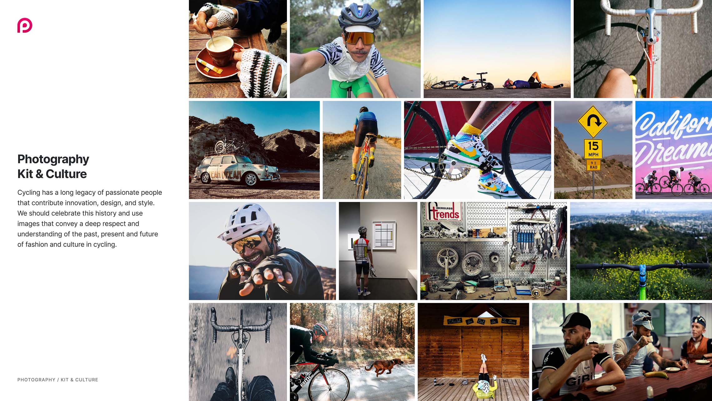
Brand Identity
Preem was created to connect cycling enthusiasts and enhance their riding experiences. It was a smart cycling app that transformed each ride into an event, integrating data and social connections to help users plan, share, and relive every moment. I led the brand development and design deliverables across all channels for both the Preem App and Preem TV.

brand positioning
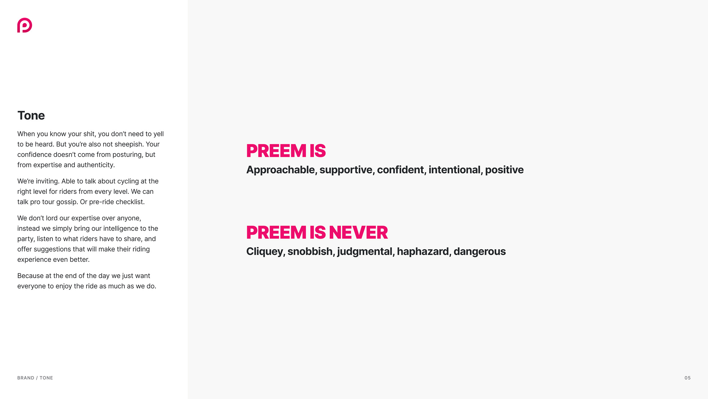
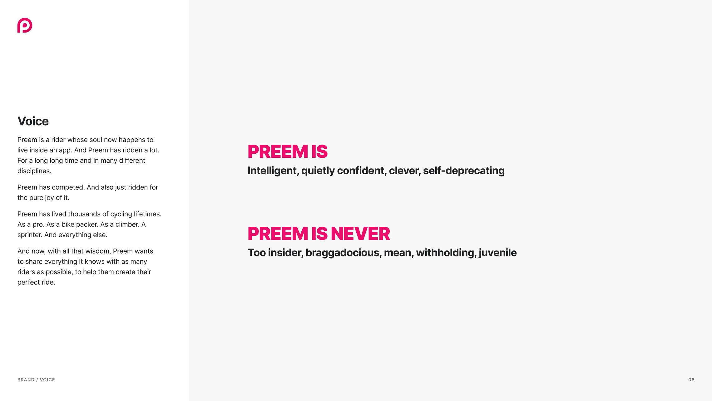
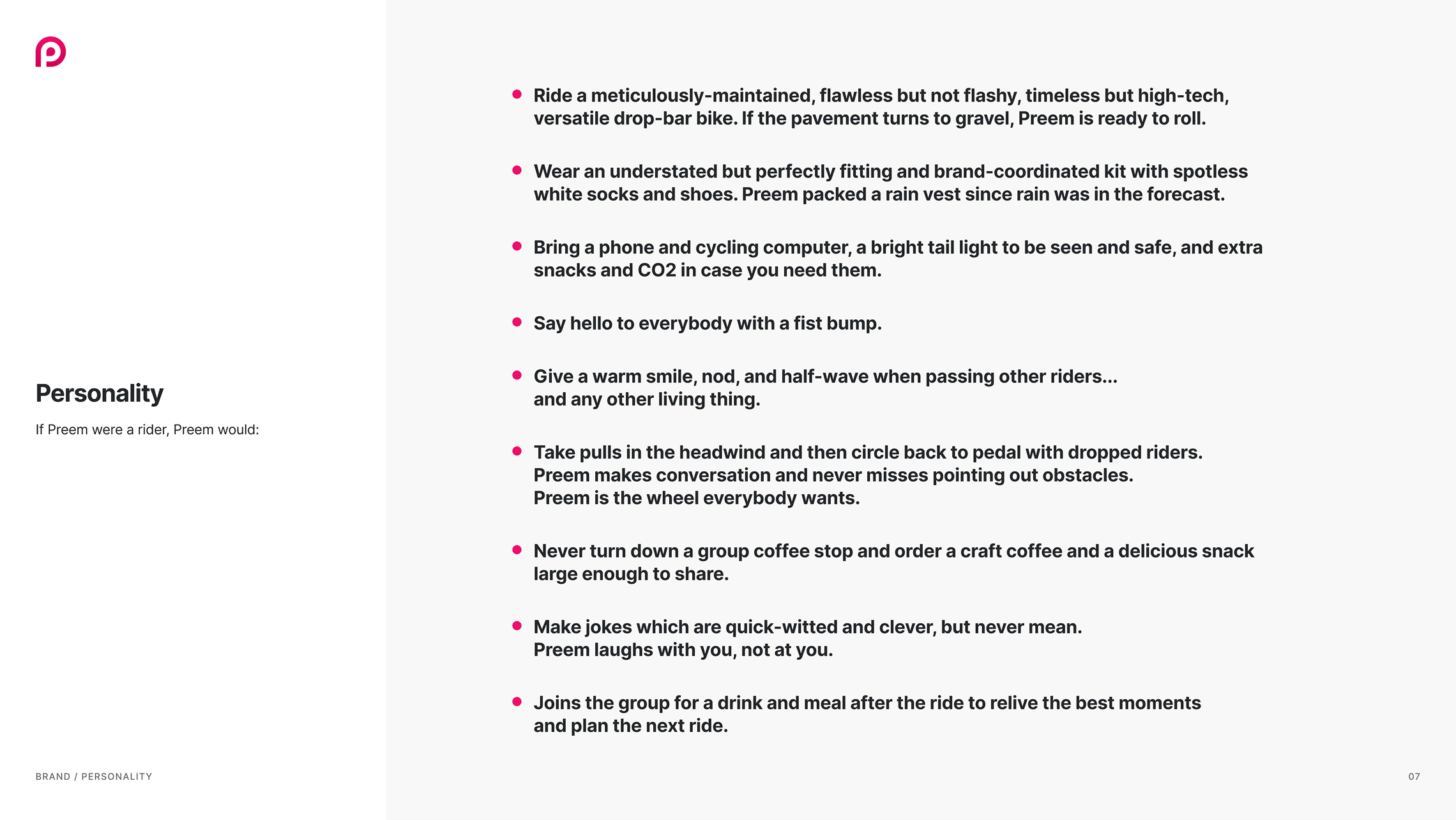
All great brands establish a solid foundation of core beliefs and statements that guide all subsequent decisions. This brand positioning produced clear declarations for the brand's tone, voice, and personality, providing concrete examples of brand language that defined how to stay consistent and on-brand.

Logotypes
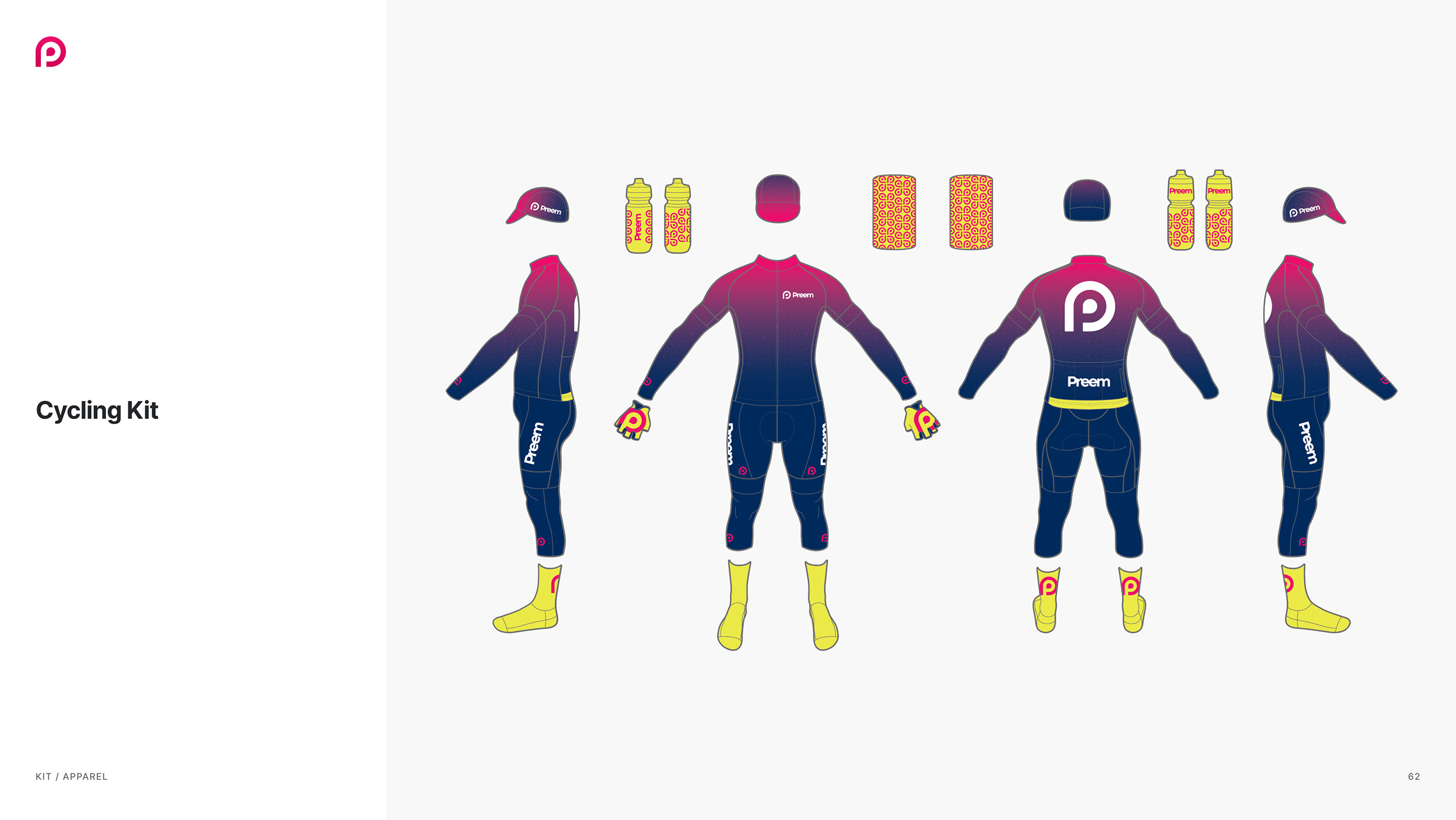
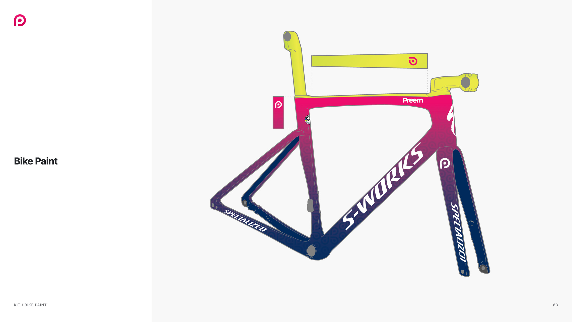
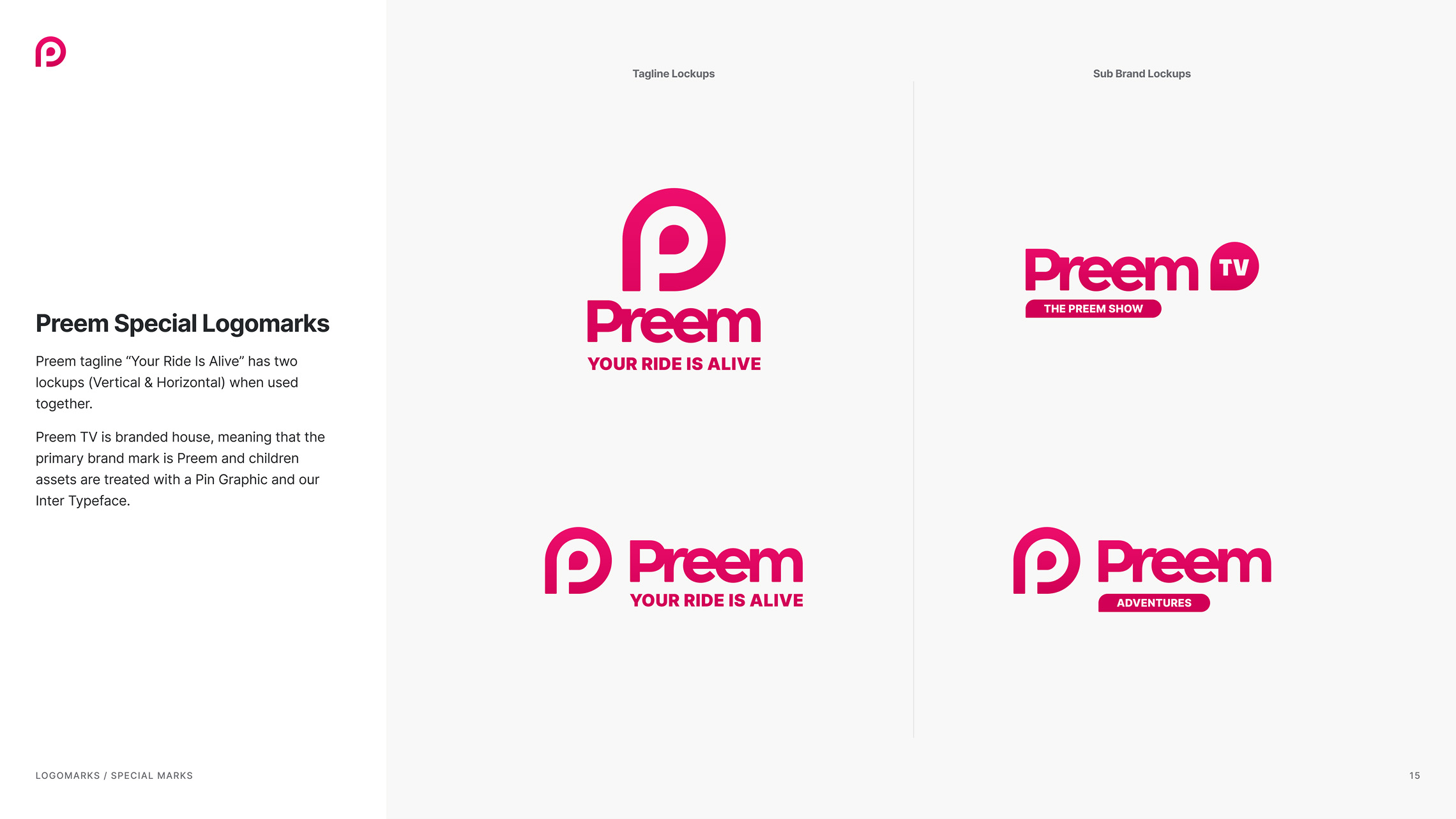
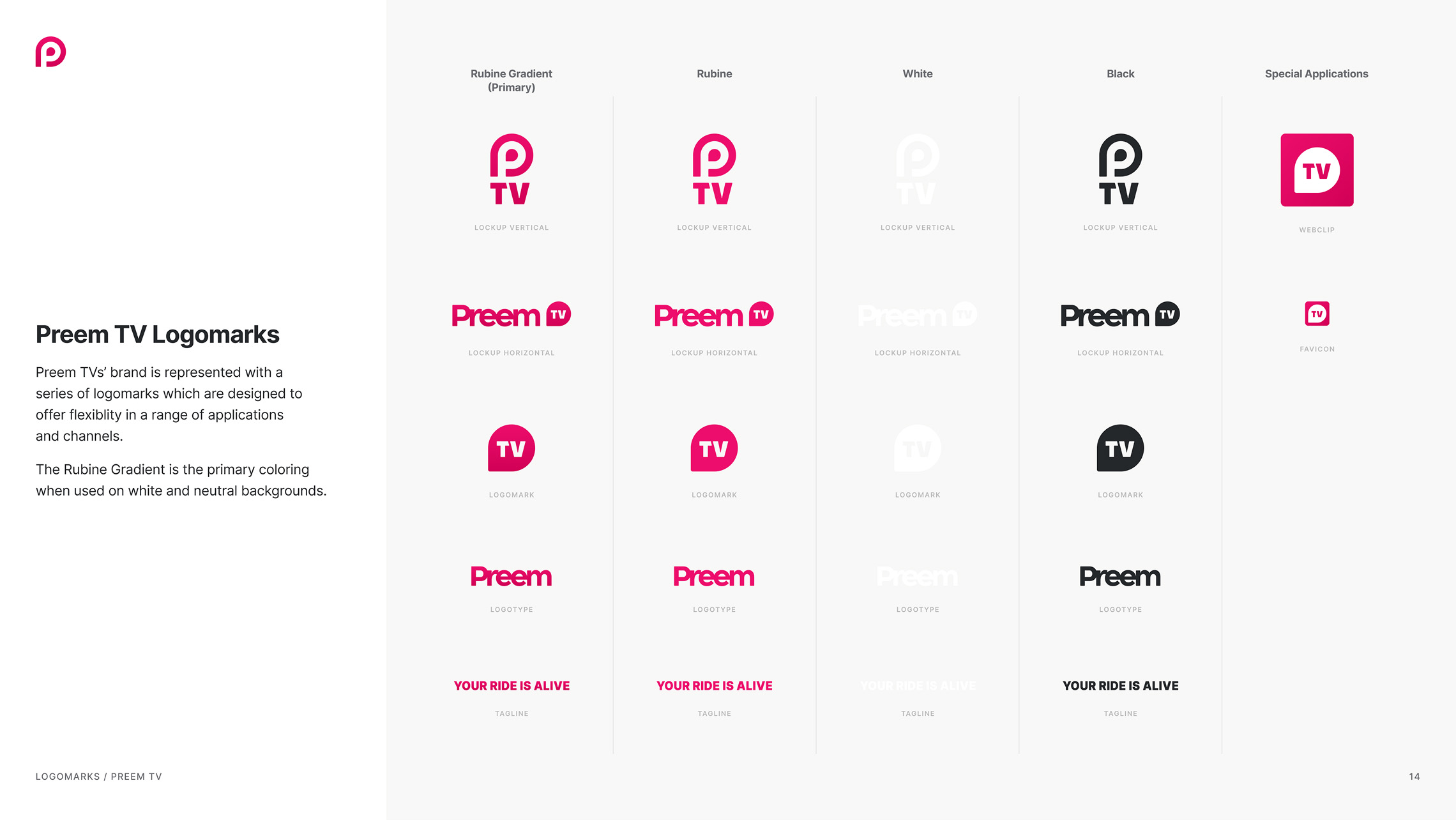
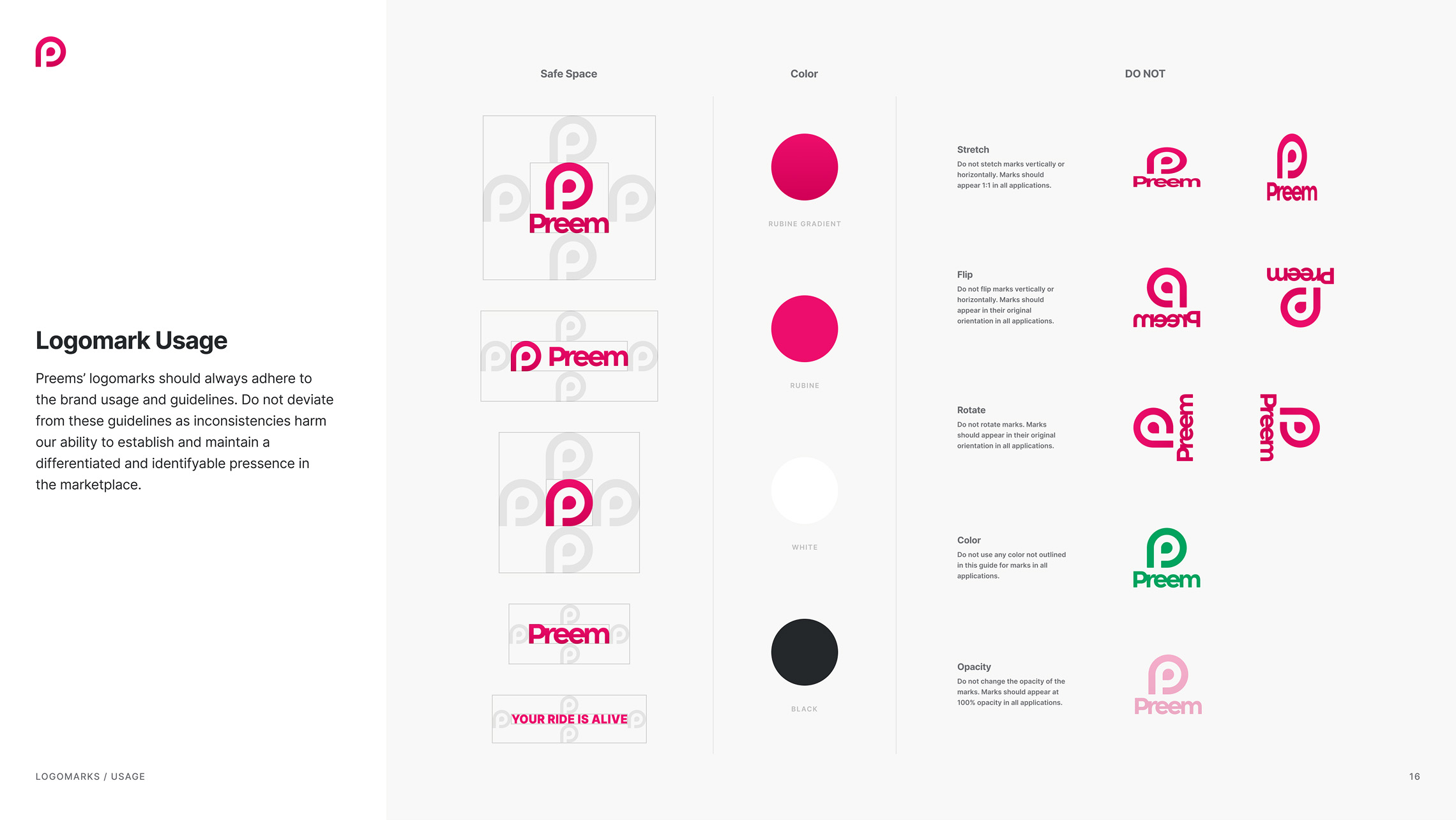
The Preem App and TV channels required flexibility while still maintaining brand identity and consistency. The Preem logomark 'Pin' referenced the marking of specific locations and points of interest on maps. It also provided a simple geometric structure that formed the foundation for styling graphic elements throughout the brand design system.

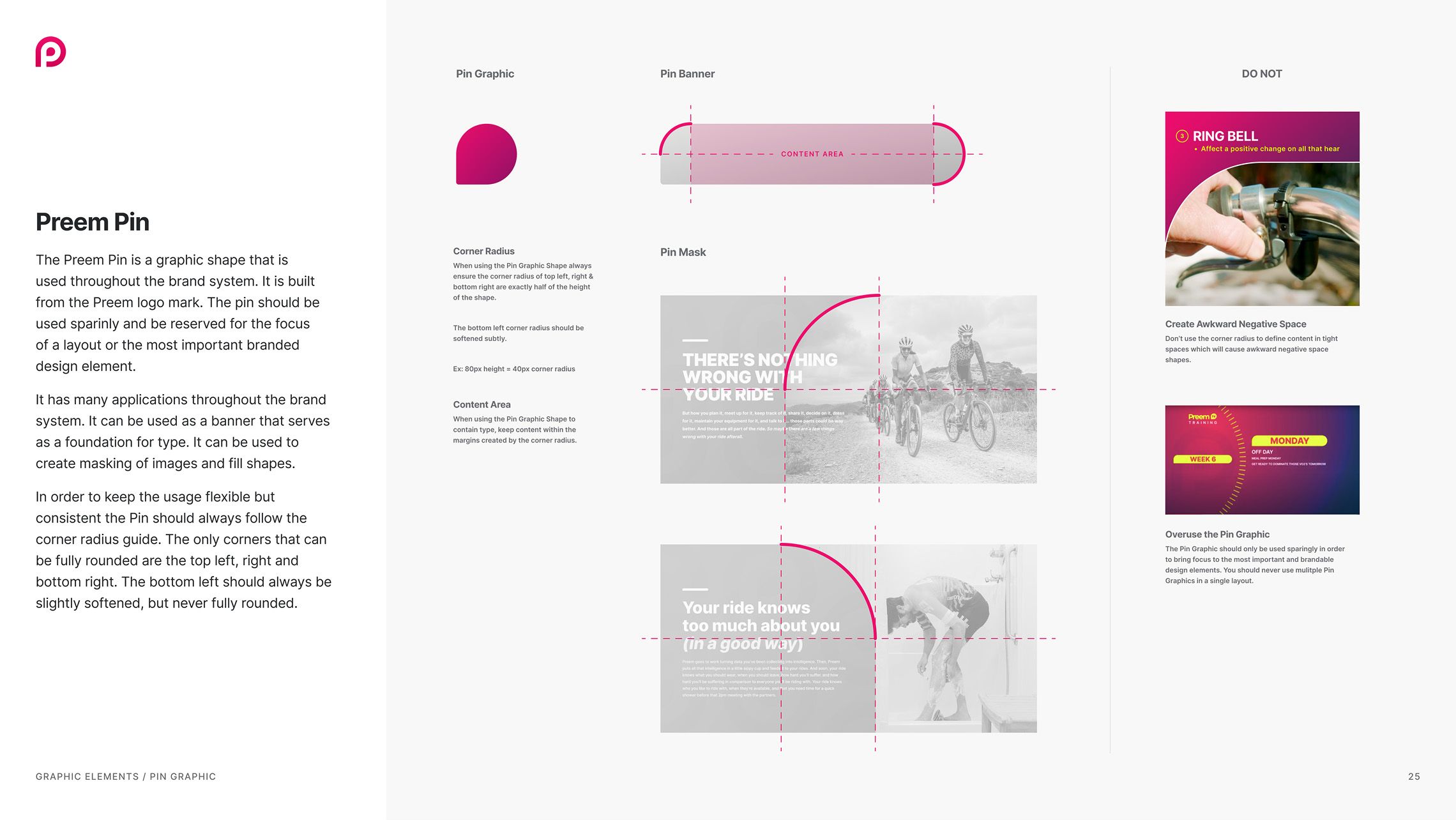
graphic elements
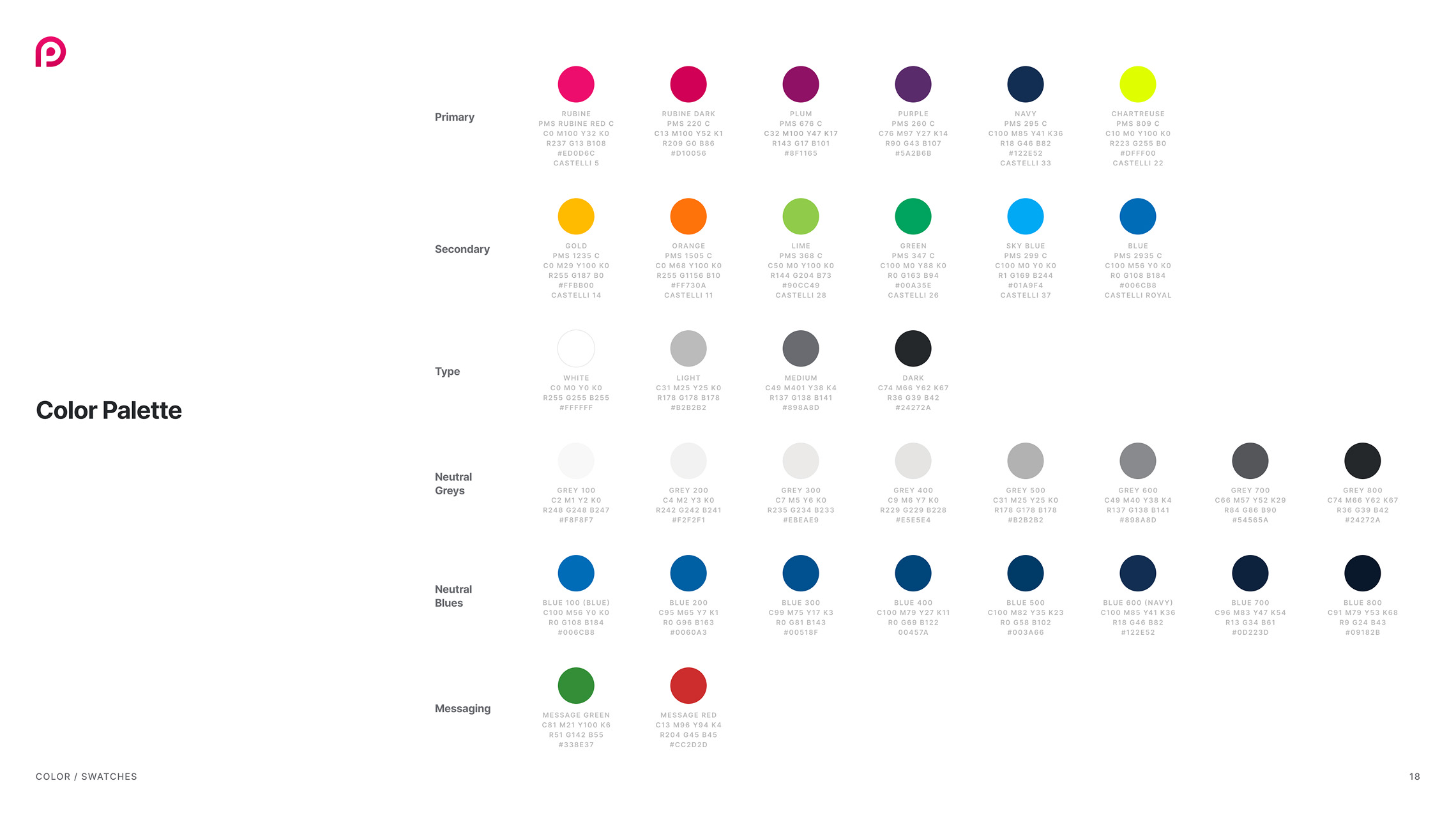
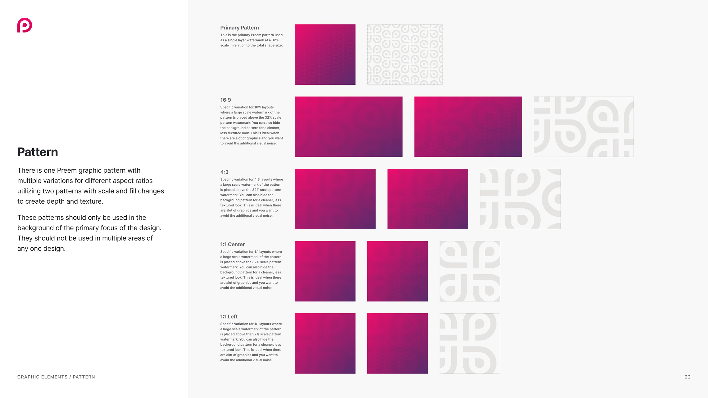
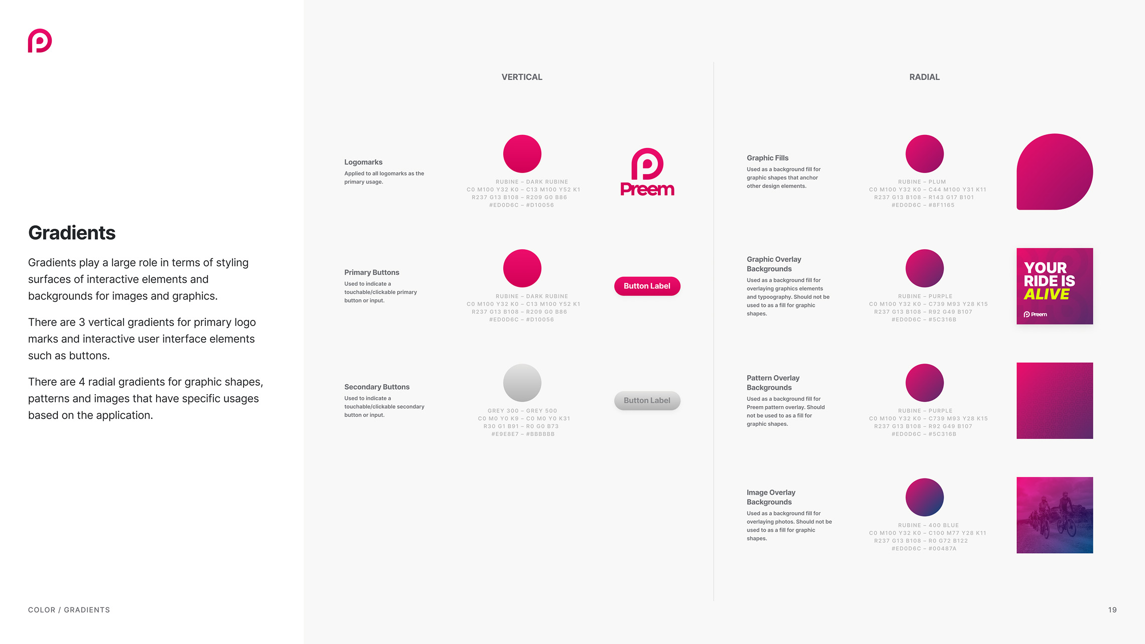
A comprehensive suite of foundational graphic elements was defined to provide the building blocks for all design demands across all channels.


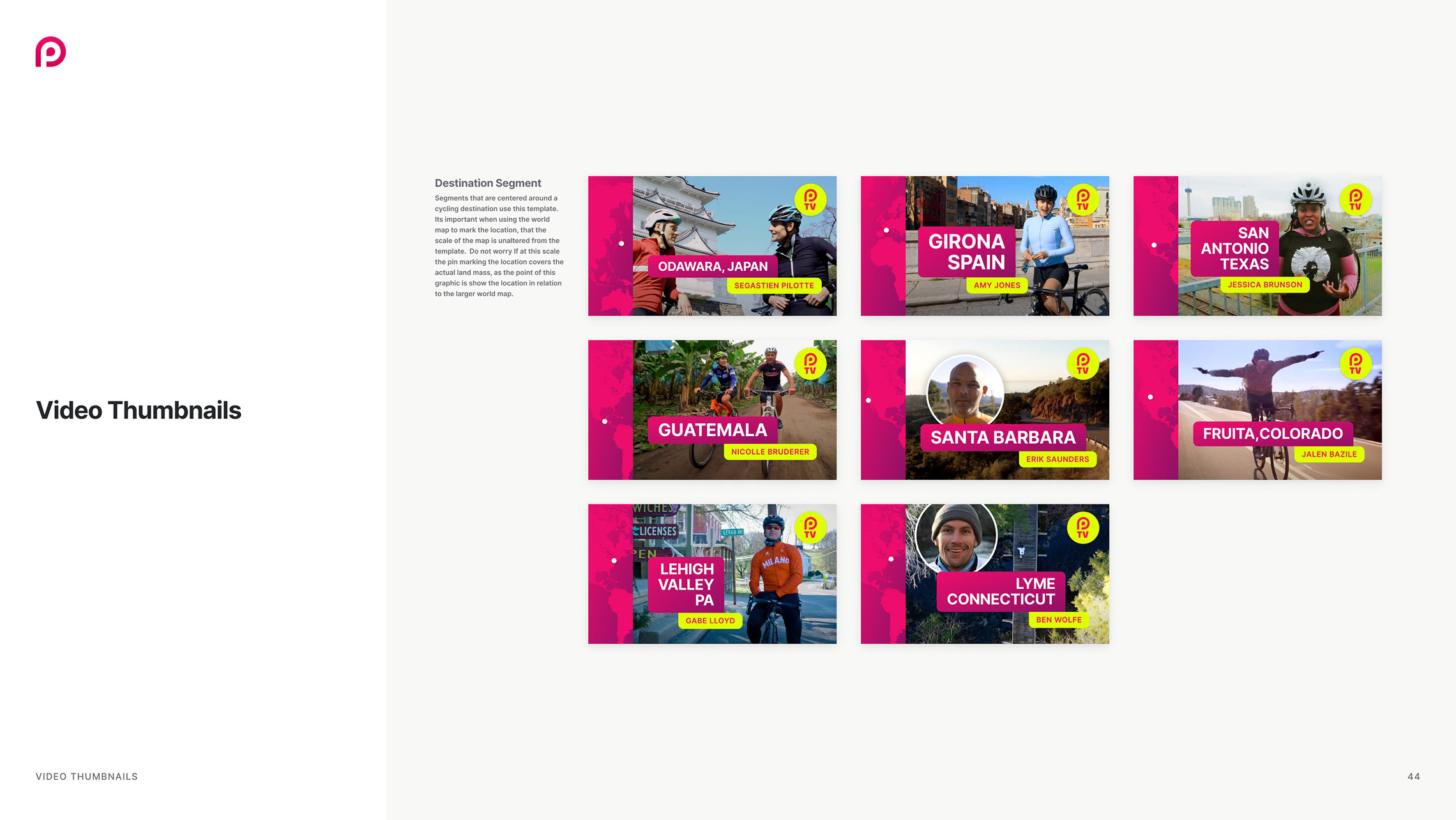
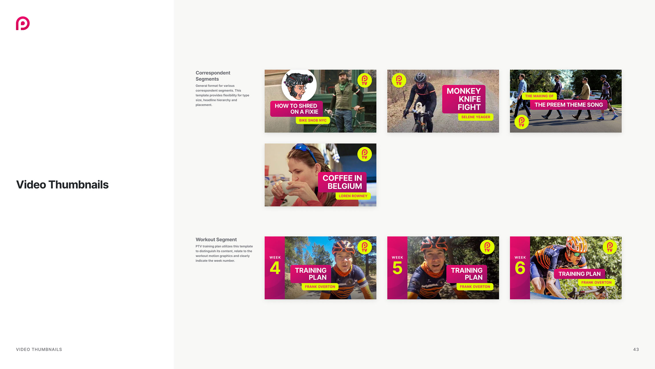
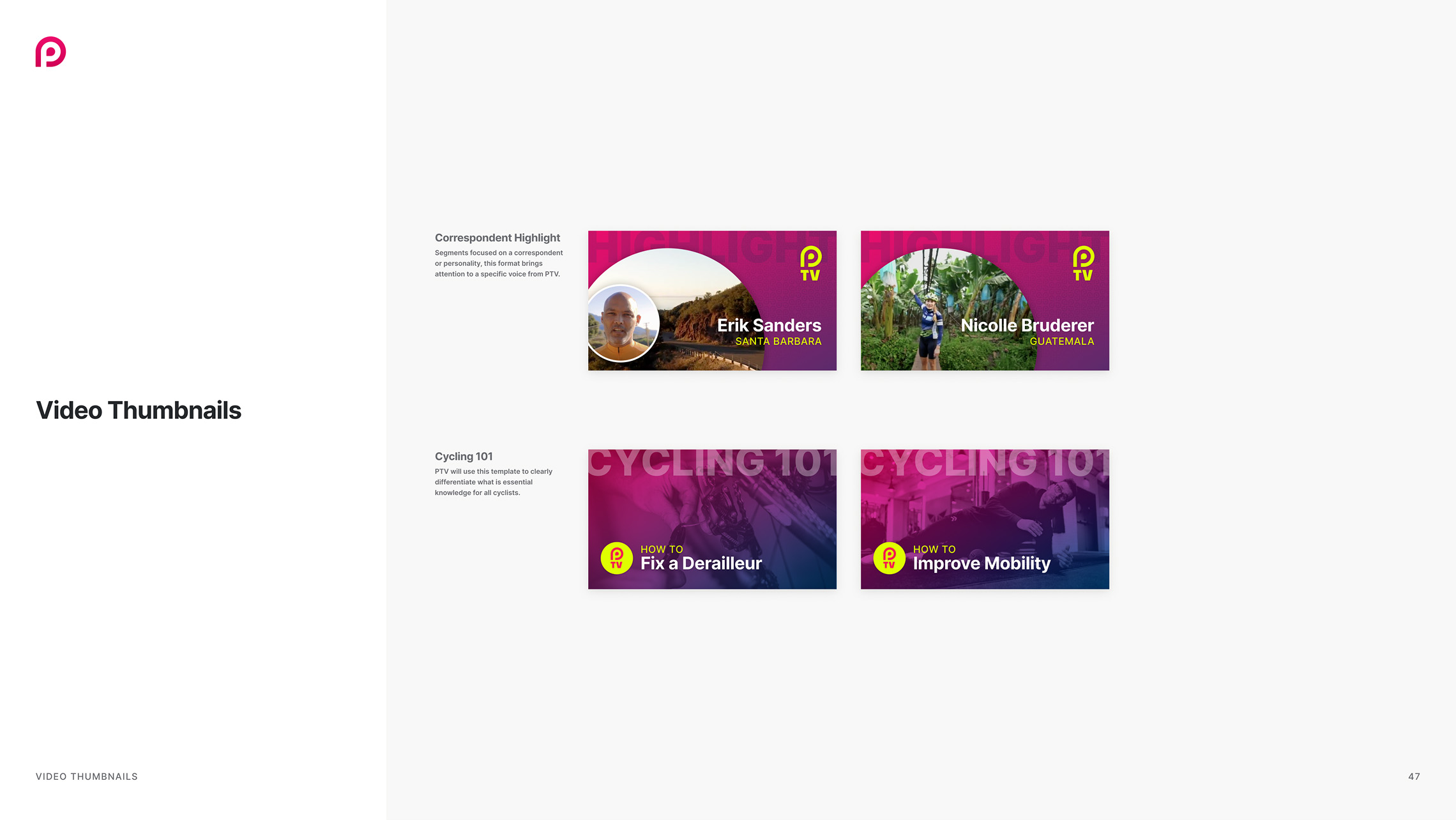
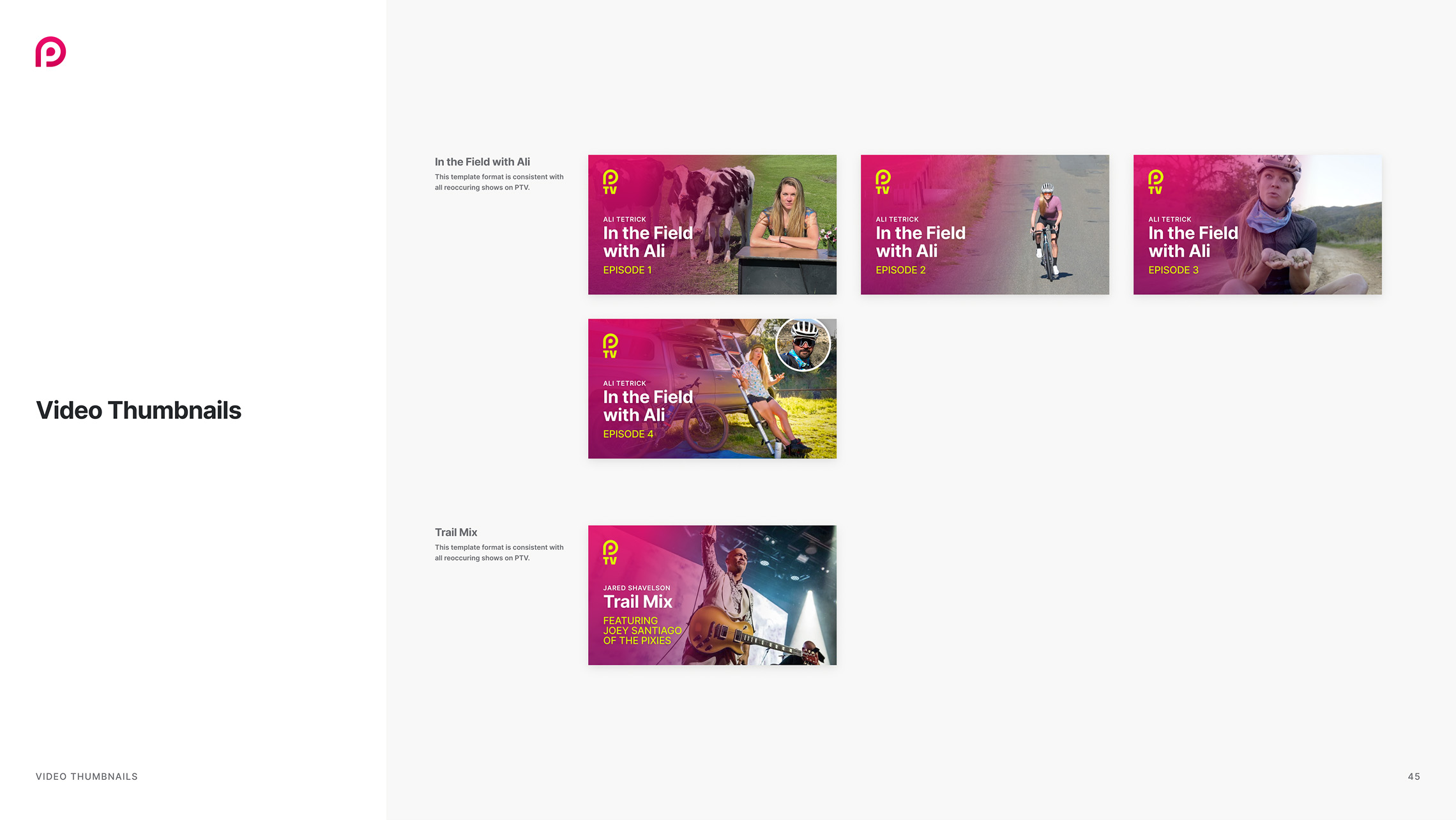
video thumbnails
Preem TV was a YouTube channel designed to complement the Preem App. Together, they aimed to celebrate and support cycling community culture. Various thumbnails were needed for Preem TV videos to define the type of content while maintaining brand consistency.


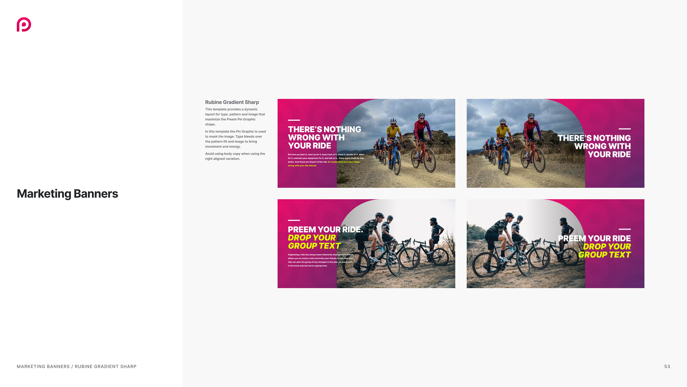
marketing banners
Marketing banners showcase the brand's personality through impactful layouts used across various channels.